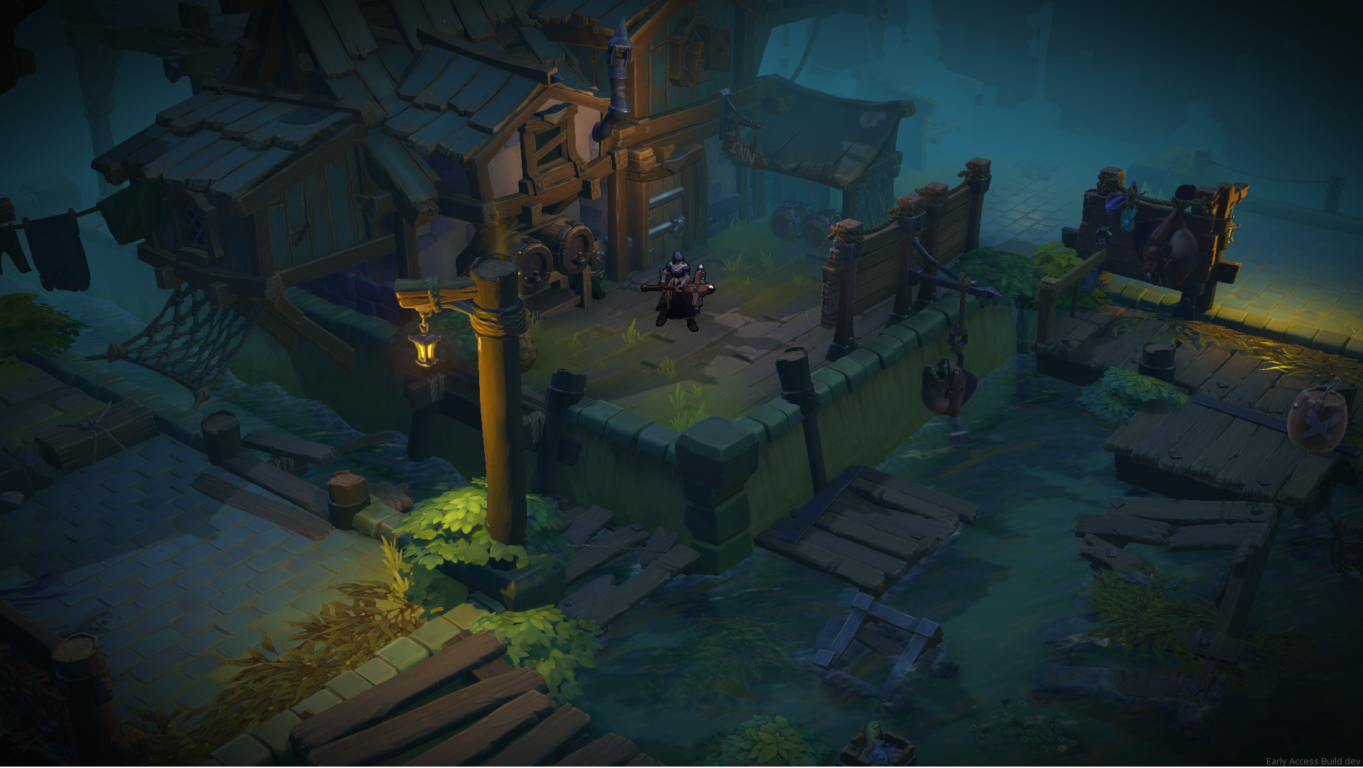
Welcome to the third chapter in the Darksburg Dev Diaries! Where today we will be talking to Lucas and Lary, who make up our amazing level design team, about all the work that goes into creating the world of Darksburg.
In Darksburg, Survivors and Revenants fight each other in different parts of the city. What were the main inspirations for you when creating Darksburg’s levels?
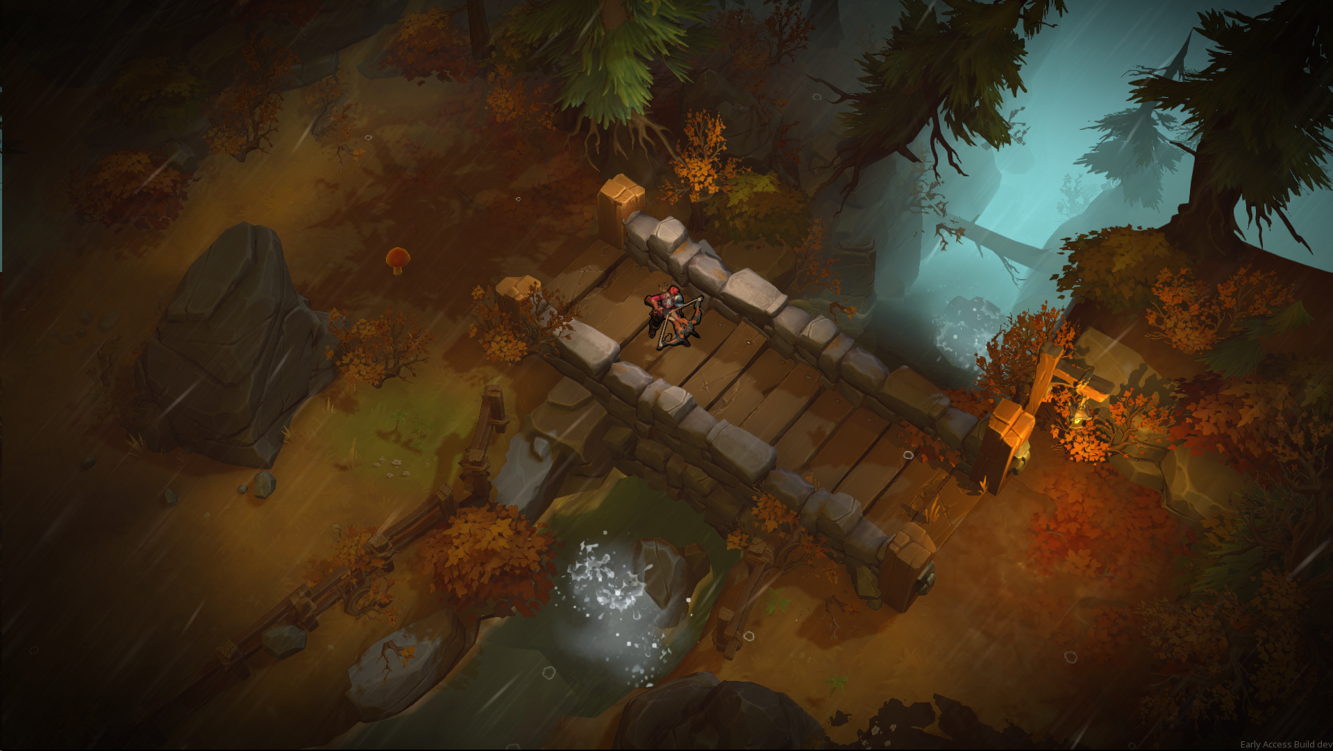
"Gameplay wise, it was really important to have a style that reads well from a top-down camera with large chunky shapes and smooth edges. Our style mixes handpainted details and material work to get nice reflections on surfaces. Our main game inspiration are Heroes of the storm, Battle Chasers and League of Legends and Diablo 3."
"About design, it’s quite hard to find references and guides for non-FPS games, so we had to do some digging to find interesting inspirations. Obviously, Left 4 Dead 1&2, Vermintide 1&2, and games like Alien Swarm were interesting guidelines for the game, especially regarding the overall architecture of a level. We’ve also looked for games like Battlerite, Heroes of the Storm, League of Legends and Diablo to learn about level design with a top-down camera."
What are the steps in creating a new level? (Graphic and Level Design)
"At first, we talk about what we want to do with the level. What are the key elements going to be ? What setting do we want to explore ? When we’ve settled on something, we start drawing rough paper sketches, to define the global progression of the level, and how the different parts articulate around each other. Then we do more refined paper sketches, and we actually start building the level architecture, the obstacles and the paths.
When the sketches are ready, we move to the engine, using grey blocks to build the layout. At this point, we begin to check collisions, making sure players and enemies can move to any point of the level, and we also verify that the important things in the level don’t get hidden by the layout and the blocks.
Afterwards, we start including gameplay on the level: Zombies, Revenants, events. This is the first time the level is actually tested a lot, to make sure that things work as intended, and we do several retakes if need be, because we want to validate the level before actually doing the environment, to not waste time and resources."
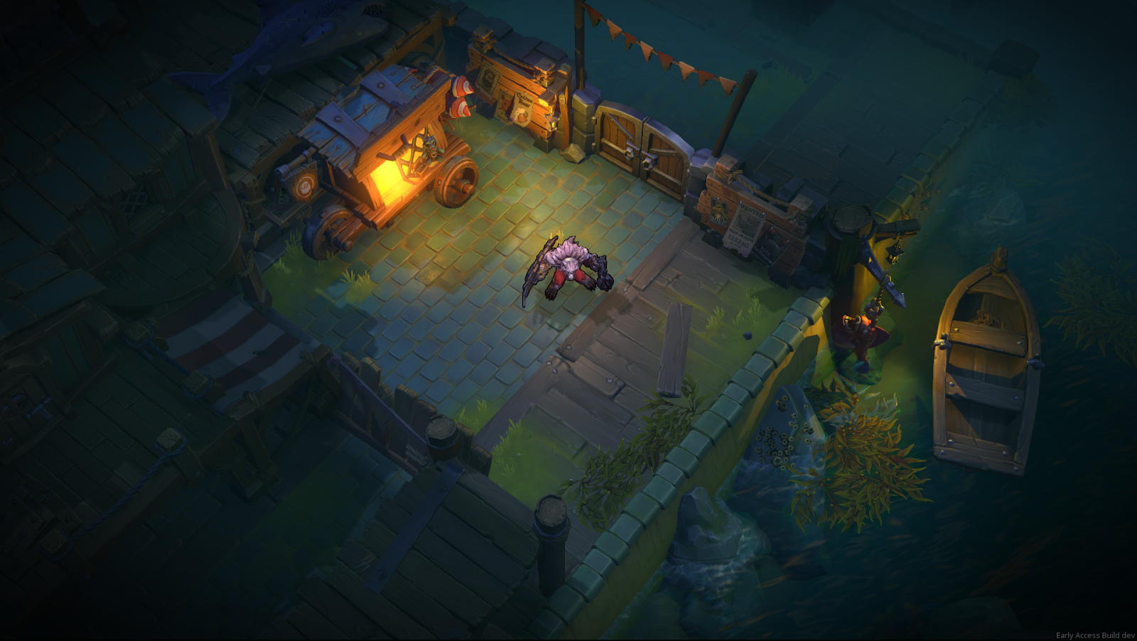
"Once the layout has been tested with grey blocks, we’re replacing blocks with assets and painting textures on the terrain/ground. We always start with shapes and assets that takes the most space, like buildings, fortifications, docks... It’s really important to test the level at each step, so we can avoid problems and find solutions. Is this collision readable to the player ? Do we have assets hiding characters ? Does it feel right to have this kind of asset here ?
When we’ve finally replaced every block, it’s time to add more story with smaller assets, like grass blades, ichor marks, hanging signs, etc... so that the level brings storytelling whenever it’s possible.
It’s also at this stage that we add lighting. Placing lights at the right spot helps catching the player attention and guiding them throughout the level. It also accentuates certain assets and parts of the level that are visually interesting.
The final step is the most fun! We’re polishing every aspect of the level with all kinds of elements. Starting with visual effects like flames on brazier and torchs, small fireflies around lanterns and flies on fishes.
On top of that, we add ambient sounds. Some are mostly global like wind, water around the docks, or crows and dogs barking. And we use some of them in very specific places to highlight other elements, like flies previously added in visual effects. That final step brings a lot of detail and richness into the level."

What’s your main concern when designing the atmosphere for a level?
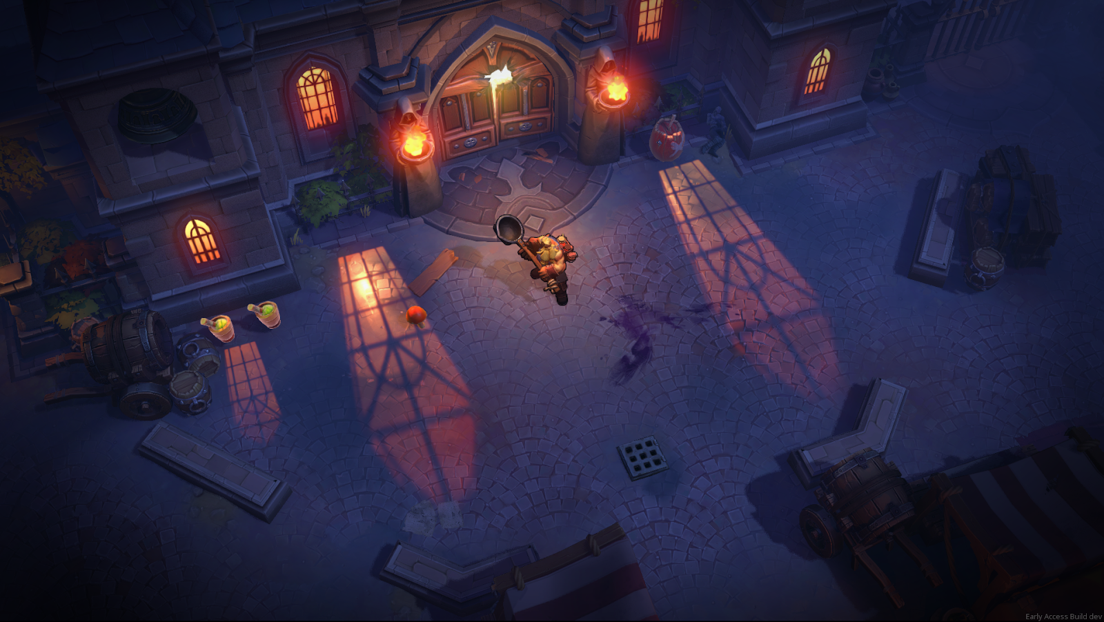
"We always make sure to create a different atmosphere for each level. We’re playing with many elements like the fog, lighting, weather, colors.. All of these play a huge role in the final mood of a level. A bright daylight conveys a different feeling than a foggy rainy nighttime.
It’s really important to accentuate what the level design is trying to accomplish. If an area is made to be claustrophobic for the players, we’ll avoid open vistas. If there’s a place/area to defend, we’ll make sure to highlight it and tone down the rest."
"We’re just making sure everything is nice and clear to the players. Design-wise, we try to communicate a lot with the way the places are built: Open / narrow spaces, pathways, obstacles, lines of sight, are the things we pay attention to."
What are the main issues you faced when designing a level?
"Every level has to feel unique. We always try to come up with new challenges, things the players haven’t seen before in the game. We also look for “Wow Moments”, memorable events or locations that are either fun or challenging (the haybale and the shark are such moments). However, the biggest issue design-wise is to manage the level pacing, so that players neither get bored nor overwhelmed. Just making sure the overall flow is nice and enjoyable.
There is also a tension between the level being plausible, credible (so that players can understand and relate to what is happening), and the level being interesting, challenging (so that they have fun playing through). While designing the level, we make concessions regarding either, to make sure the overall result is the best of both worlds!"
"On the visual side, it’s important that each level brings something special to Darksburg. Every level should add more storytelling to support the adventure our characters are living. And obviously we want the most beautiful result possible!"
What’s your favourite Darksburg level?
"Harbor is my favorite! I really like the colours and the mood. Also, it was a blast working on it and creating assets for this level."
"At this point I don’t really have a favorite. Each of them is a unique setting and a unique challenge, and that’s mostly what I’m looking for. I hope you enjoy playing them as much as we enjoyed making them!"
